

Above, demonstrates how our first cut to our thriller opening title sequence and we had picked up on a few aspects that we could improve to make our second cut such as:
- We had not yet included a production company that would usually be introduced in a film’s opening title sequence.
- The non-diegetic background music is good because it’s quiet eerie, making the audience feel intrigued when watching the sequence; although it is quite repetitive.
- The typography has a short duration as it appears and then quickly flicks off screen, meaning that there’s not enough time to fully read the names; but it’s great because it’s captivating whilst not distracting the audience’s attention from what’s going on in the shot.
- We had not included the final typography text which would be the name of the film, so this is something we would have to add in for the next time.
- The diegetic sound of book closing, finalises the sequence and leaves a lasting impact on the audience because of this; which I think it would be good if the name of the film popped up onscreen soon after.
Above is the second edit/cut for our thriller opening title sequence, and below are a few comments on what we had thought when re-watching it:
- This time we had included a production company called “ICE PRODUCTIONS”, which the white typography text gradually zooms in before quickly fading into the black background; this leaves the audience on the edge of their seats to see what this production company “PRESENTS”…
- We have used the same music as in the first cut for our opening thriller title sequence.
- The longer duration of typography text makes the audience acknowledge the credits behind the production of the sequence, as well as having the text much more bolder and larger means it’s easier to read, than before when it was thin and smaller.
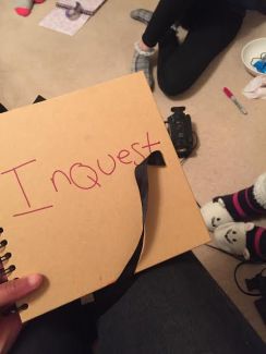
- We had the title of the film (INQUEST) at the end, straight after the diegetic sound of the book closing that can be heard, which meets our improvement we had decided in our previous edit.
For the third title sequence exhibited above, we had changed many parts including:
- The production company sound is louder which instantly intensifies the start of the sequence, captivating the audience.
- The diegetic sound of the blind roll moving overpowers the soundtrack, this gives quite an eerie impression evoking the audience’s emotions of anxiousness.
- The addition to the voice-over includes “don’t look behind you” and then the girl does exactly this; suggestive of her not aiding her conscience, so not knowing right from wrong.
- A variety of synchronous sound is now used such as the sound effect when she jumps off of the bed, the scratchy sound effect when she circles in book, and the sound effect of the turning book page.
- White noise plays throughout all the way to the ending, as in our previous rough cut, one member of the audience suggested to include white noise in their feedback response. Therefore we had decided to see if this would work, and agreed together that it does fit perfectly in creating the effect of wearing out the suspense which has built up throughout the extract.
Above, is our final cut for our thriller opening title sequence called “INQUEST”, which we had added more sounds into the voice-over since the previous edit, such as more whispering voices overlapping each other that makes it difficult for the audience to comprehend what they are saying. Furthermore, we believe this is reflective of the character’s mental instability as the voices are inside her head and she can’t configure them so they overpower her and ultimately have lead to her committing various crimes…

Within media texts such as Tv, films, magazines and several other forms, representation is a crucial part as it’s the process of making meaning, referring to the construction in any medium (mass media) of aspects of reality.
Therefore, not only does representation relate to my understanding of media studies, but I am also applying a form of representation (in particular, age) to the opening title sequence as a group that we are creating. As a result I have decided to post about the representations of age in the media.
For instance: I had taken notes about this, see below:

Which enables me to highlight the similarities of children’s representation to the opening title sequence as it’s of a teenage girl who is acting mysteriously, only later revealed in the credits as the antagonist of the film due to being associated with the crime case, the potential suspect of the various murders…
Furthermore, as media’s representation of groups of people is based on age, it’s generalised and categorised on the basis of stereotypes including:
- Childhood- this is depicted by the media in positive ways such as ‘cute’ particularly in Tv adverts that are aiming to sell baby products, or ‘victims’ of crimes that have had an affect on them; either way society lives on this expectation of young children which has ultimately been influenced by the media. On the other hand, we chose to base our media task on the fact that some children are seen as “little devils” like my notes on the American cartoon ‘The Simpsons’ suggests.

- The elderly- sociological studies show the elderly being represented in one dimensional ways like being “grumpy” to social change, “dependent” on their family, or suffering from being “mentally challenged”. But my group’s idea doesn’t subvert or conform to these stereotypes as we have not represented this age band at all in our opening title sequence for a thriller film.
Therefore, we wanted to uncover the difference between media representations as our media product reflects societal expectations by both conforming to the idea of teenagers being “Folk Devils” as well as merging this with the female character behaving like a child, suggesting children are also capable of this. Which subverts the audience’s expectation due to them believing the complete opposite of the stereotypical idea children are cute and innocent.
This time filming, after we had all agreed to change our idea to having a girl who believes she is both a child and a teenager, meant that we had to adopt the mise-en-scene, in particular, to suit this.
For instance we decided to use several point of view camera shots in a mirror by placing the camera in a position where you can’t actually see it in the shot, whilst the girl is putting on her make up in a childish way. Which we had decided to film two of these shots, where one would end with her smudging the makeup, to the next shot of her rubbing her clean face. This demonstrates how she has two complete different personalities as exemplified through the merging of the two shots together, like in the 1997 film “Contact” the ‘through the mirror trick’ shot inspired us. For the reason that the fantastic cinematography, most known in the scene of the little girl running all the way upstairs to retrieve her dying father’s pills in a cabinet, was a single shot filmed through the mirror on the door of the cabinet. (See below for the short clip that displays this taken from the film) :
Therefore, we liked making the audience feel captivated by the connection with a mirror, so we had decided to film this.
")
")
Another change we had made when filming, was that we had decided to actually write in the scrap book, not like last time where we had just filmed her highlighting the newspaper headlines, this time she had made comments such as “Dead” underneath the Polaroid pictures as well as circling and drawing arrows. For the reason that it would make it more interesting and we could then add in sound effects over the top of the pen marking the page.


Furthermore, we decided that to maintain the audience’s understanding of the girl being the murderer and so the antagonist of the film, we created a new page where she was listing various names of her new “Target”. This meant that the audience would know she is the cause to the deaths of all those in the pictures displayed in her scrapbook.

In addition, we changed the layout of several of the pages in the scrapbook as Nicole had brought in many newspaper headlines that we could then use to fill up some more of the pages; these were particularly good as they related well to the topic of our opening title sequence. For example “STALKER” links to the crime sub-genre as the police would most often be involved in this sort of case, so when we had filmed the girl scraping a sharp knife across the picture next to this headline, the audience can infer that she has something to do with it.


Then finally, near the end of filming, we decided to film the end footage twice, the first where the girl would shut the book and the cover would be left blank; this meant that we could edit the typography text on top of it. Or use the footage where we had filmed her writing the name of the film- “INQUEST” on the cover in marker pen, but this didn’t work as it didn’t turn out as we had expected, so we had decided to use the first idea.
Therefore, I can conclude our final day of filming was successful as we had filmed everything we needed to have done, which took all of our previous feedback into consideration as well as adding new ideas along the way.
But all we have to do now is to add the sound effects in, create and use a voice over of whispering voices telling the girl what to do, and the non-diegetic background music.
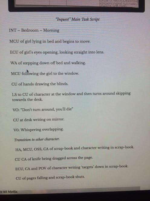
As a group we had decided to adapt our idea slightly for the reason that we thought that having her getting dressed for school, creating the scrapbook, pinning the string on the board was too much for us to create for a thriller opening title sequence. Therefore, we made new planning documents such as the script and shot list that exhibits our new idea described below:
Originally, Ellie had the idea of producing a title sequence that evolves around a girl who has multiple personality disorder, believing she is both a young child and an elderly woman. However, we thought this would be too similar to a trailer and thus difficult to create a title sequence. Then our second idea was to have a female character as the antagonist of the film, exemplified through her actions of creating a scrapbook with her murdered victims inside. But after 3 times of filming based off of this idea, we agreed as a group that this wasn’t work for us, as our plan and the actual product didn’t end up as what we had imagined. Therefore, we came to the conclusion that we needed to adapt our idea, even if this meant that we would have to recreate the whole product. Which to do so, was possible through merging these two ideas together. Furthermore, having a girl with a multiple personality disorder act in a certain way by creating just her scrapbook with her victims inside became our new idea and we all agreed in liking this.
This meant that we could still use all of our props we had previously used in the last drafts such as the Polaroid pictures, the scrapbook itself, the cuttings of newspaper headlines, but not the map with the red string.
Our title sequence will still conform to most of the forms and conventions of the crime thriller genre for instance the antagonist is still portrayed through the low-key lighting and shadows representing evilness within the girl, and the headlines of “We have Lost faith in cops” exemplifies an aspect of the crime genre.
As a result, our Director Nicole created the script which summarised the main actions, character and setting as displayed below:
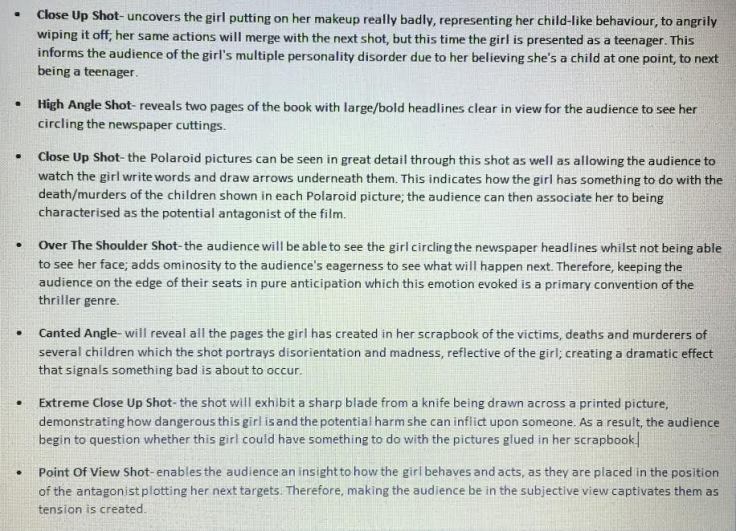
Then as Director of Photography I made the shot list which explains our group’s choice of shots and the intentional portrayal of meaning through each of these shots:
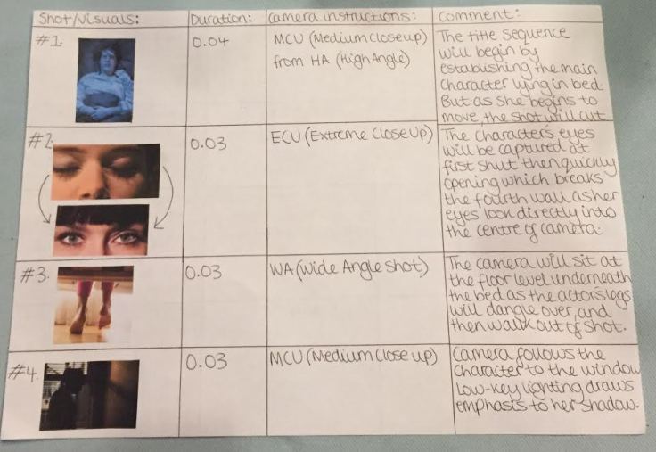
As well as I had decided to make the storyboard as displayed below, which demonstrates the shot type, duration, camera information and comments to do with the story:


The below images display my group’s target feedback we had received through using Survey-Monkey, where we had asked a range of questions, ranging from information about themselves such as their age and gender so that we could get an average for our target audience in which we would aim our media product to. As well as what their perception of the key characteristics and conventions associated with the thriller genre.

This question above demonstrates how the majority of those who had participated in the quiz, had their favorite movie being Taken, which is a action-thriller. Therefore, we can infer that the rest of the information had filled out in the quiz would be based off of this; meaning that the conventions they believed to be particular in thrillers, would be that of the hybrid genre of an action thriller.

That fact that we received the survey feedback on the majority (being 60%) not mattering if the lead character its female or male. Therefore, this supports our idea as we have chosen to portray a female character who is stereo typically meant to be inferior and subordinate in comparison to men, which we question this by representing the woman as the antagonist of the potential film.
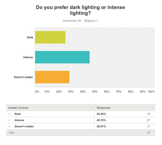 This changed our original idea as we had previously filmed with low-key lighting as shadows and the darkness would be emphasised on the board when the girl would be pinning up the string. But as this made the footage appear quite grainy, as well as the audience preferring to have intense lighting in the form of high-key rather than low-key lighting.
 We have taken this survey feedback into consideration, but will change our approach to what they have said, as 43.33% would like to see the character, but we will have a character in the opening title sequence whilst not revealing their face. For the reason that this is a typical convention of the thriller genre to not have the antagonist seen throughout the beginning of the film, only to be uncovered later in the near end of the film.
 This question above, demonstrates how our audience would like to engage within the thriller opening title sequence as asking if they prefer one with non-diegetic music or dialogue is significant. For the reason that we want to produce a media product that would target this audience’s perception of what they believe to see when watching a thriller opening title sequence. Which we have received evidence that our audience prefer music rather than dialogue; so we will take this into consideration when producing the sequence.
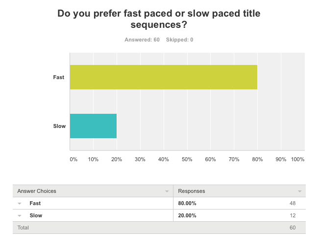
To see whether our audience would like either a fast pace or slow pace sequence, we decided to ask this question in our Survey-Monkey, to only find out that 80%prefer a fast paced sequence. Therefore, meaning that we should create a thriller opening title sequence that will conform to our audience’s expectation, or we could subvert this by creating a slow-paced one. But the only problem with doing this would be that although it’s unique, we would need to ensure that we keep the audience engaged, because if not they could lose interest. Furthermore, the film would not be categorized as a thriller due to not following the conventions of this genre- to provoke the audience’s anticipation; which fast pace editing usually does this.

Due to our response in our second feedback, we had received several comments on the misinterpretation of the title “INQUEST” for our opening thriller title sequence. Therefore, we had decided to change the layout of the set, in which the audience would be able to see the letters made out of the red string much clearer.


The image above, on the left displays our new recent set, in comparison to the image on the right which was taken during our first day of shooting.
Furthermore, the differences include removing two of the printed images that we had thought were quite irrelevant, in the sense that the images had no relevance to our media product as one was simply just someone’s eye and the other was dark and blurry. So removing these elements from the board, meant that we needed to have something else that would replace the empty space; which we had decided to use the polaroid pictures that would enable us to have a credit of that person shown in the picture. Our mise-en-scene then became more specific to our task as well as developing our opening title sequence due to the audience not being quite able to see the exact letters as a picture was making it difficult to see.


Also, another improvement that I believe we had met, was the fact that our feedback uncovered many members of the audience picking up on how the footage was quite shaky, where we perhaps had not used a tripod. Although we had some difficulty in setting up the tripod as there was a missing piece that we need to use to attach the camera to the tripod. But Kate went to get another two where one was quite large, which we could use to film the girl pinning up string on the board. The other was small so that we could use this one to put on the table and film the part where the pages are turned.
Therefore, we had used a tripod to improve this element of our improvement, as it enabled us to film the footage without looking shaky and staying in focus throughout.
As a result of not including titles/credits in our sequence “INQUEST”, I have decided to do a blog post on the way in which titles are ordered in the opening to films and the reasons behind this.
Which opening credits for films can be creative in expressing key themes that will be revealed later in the film, and are practical in the sense of informing the audience who is involved in the film including: (in the following order)
- Name of the studio/distribution company- who have sold the film into cinemas, DVD’s, television plus many more; sometimes this is listed as text, a logo, or a well-known clip for that institution like the lion as the mascot for the Hollywood film studio Metro-Goldwyn-Mayer.

- Name of the production company: this is for the company that is responsible for making the film, listed under “In association with…” or “A (studio name) production”.
- Production (Producer’s name): which the producer is the key coordinator for the production as they are involved in the production process and the financial/administrative side; in the case of our opening title sequence Kate’s name will be here.
- A film by (Director’s name): modern audiences see the Director’s name before the actual title of the film, like the 2014 film “Fault In Our Stars” (displayed below) is evidence of this. For my group the Director’s name will be Nicole.
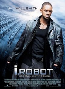
- Starring (followed by a list of actor’s names): usually it’s one to three of the lead actor’s names that’s listed before the title of the film as this is believed to be why the audience originally was attracted to seeing the film because of the three stars. Which relates to the term ‘top billing’ due to this demonstrating the position at the top of a theatrical bill with the stars names featuring on it, similar to a film poster like “i,ROBOT” starring Will Smith:
- Music, composer or original score: may be listed as one or the other.
- Hair/makeup artist: this is sometimes listed in the opening credits depending on whether the film heavily depends on special effects makeup or advanced ageing of a lead character like Tom Hanks in “Forrest Gump”, for example:

- Editor: this is the person who assembles the various shots into the story that then transforms into the film; ensuring that it meets the technical delivery specifications.
- Director Of Photography: or often referred to as cinematographer because they control the framing, lighting and composition decisions for the film; which is typically listed just before the writers.
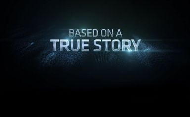
- Written by, story by, or based on: This credit acknowledges the contribution of others that may have be involved in the film through writing the original story or the actual screenplay. The “based on a true story” credit is usually apparent in horror films rather than thrillers because they use real experiences as the inspiration to the events in the film, making it even more horrifying.
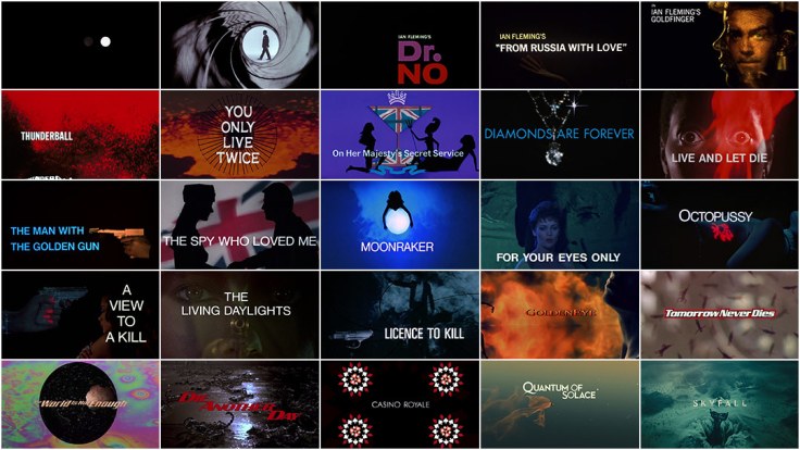
- The film title: once this appears on-screen the film will begin to start shortly afterwards. The image below is a montage of the main title design for the last 50 years of James Bond films:
In my opinion, our first cut for our media task revealed some strengths and many weaknesses because at this point we are far from being finished.
For instance the ending of the sequence was not complete, including the missing sound of the mother’s voice telling the girl to hurry up. This could be improved for next time by adding in the diegetic sound of the voice-over when the black screen is on screen in the edit at 1:33.
But my group had a discussion afterwards suggesting that we shouldn’t include this voice-over because it may take away the suspense and so we thought of having extreme close up shots of the girl’s phone with messages appearing onscreen.
On the other hand, I find the constant back and forth (called montage editing technique) displaying the making of the craft book, to her pinning items on the board effective because it builds tension as the audience are left anticipated to see what is going to happen next. Furthermore, we didn’t want the audience to be able to predict what was going to occur, so having this montage edit makes it difficult for them to do so, whilst leaving them intrigued to know more; a common convention of the thriller genre.
However, as we hadn’t finished filming completely we lacked in the amount of footage that would enable us to achieve the result of montage editing in a fast manner that would create and build suspense throughout the sequence; working well with the fast paced background music.
Moreover, we revealed our unfinished rough cut to our class in order to gain their interpretations to our sequence and their feedback to our use of camera, editing, mise-en-scene and sound; within each of their responses they included their beliefs on our strengths as well as possible improvements.
This was all in the form of SIR (strengths and improvements) on Google Classroom, see below for evidence of this:
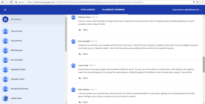

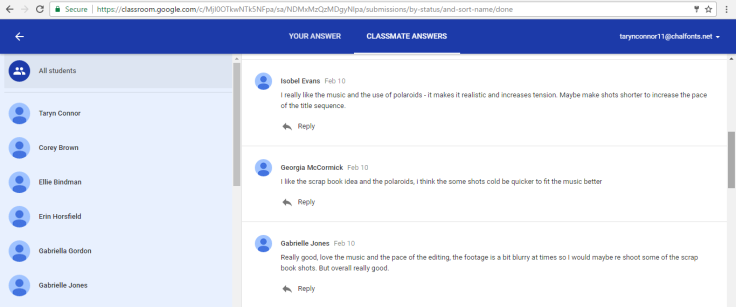
Our audience’s feedback on our strengths:
- The majority of comments described how they enjoyed the idea/story of having the Polaroid pictures with our group’s faces on it (the credits would be on this), and having the ending of the name “INQUEST” for our thriller opening credits spelt out in the red string.
- They also picked up on the variety of camera angles, shots, movement and zooming techniques used; which suggests that camerawork was a strong aspect in our sequence.
- Many comments described how the audio fitted well with what was being displayed on screen as the strident sounds of the instruments created a tense atmosphere, reflective of how they felt when watching the sequence.
Elements we need to improve from their comments include:
- Some noticing that although the silence at the beginning created an eerie effect, this was disrupted by the diegetic sound of the draw being opened, followed by a sudden transition to background music. This meant that they thought we could adjust the harshness of the sound by having it fading in and out at the beginning/end or instead someone suggested having ambient sounds like white noise playing throughout. But this leaves it up for our group to chose between these two possible ideas implied from our audience’s feedback.
- The quality of the footage was “blurry” and “shaky” at times according to the comments, which means that we have to film again to improve this; especially during the camera zoom on the Polaroid pictures as it wasn’t intentional to be shaky, we just couldn’t manage it, as the tripod’s legs would’ve been seen in the shot, so we had to use the camera hand-held.
- Also, some had implied that using darker lighting (low-key lighting) would result in the sequence being seen more as a thriller for this very reason. Therefore, we will go back to our idea of having the lighting dark, enabling more distinct shadows to be seen in the sequence, like during the final shot of the girl turning to walk away from the board, the use of shadows would contrast against the light background intensifying the end to the sequence.
- There was no use of titles/credits which the audience would have expected to see; as a group we knew we had to include the titles but we didn’t have enough time to edit this in as well as not deciding on a particular font yet. In addition, we had not yet finished filming all of the footage, hence why the duration of some shots were too long as the credit would be on the Polaroid pictures. Therefore, we will have a discussion to talk about a suitable font to use and where it should be positioned in an effective way on screen.
As you can see from these feedback comments, it’s clear that we need to re film to achieve some of these improvements I have discussed in this blog post; which I find the feedback extremely helpful because areas of mistakes in need of improvement was pointed out to us; we would of not noticed ourselves without this form that is helping us to develop our title sequence for a thriller film, on a higher level.
